Data
Source materials
Here is a list with links to the jupyter notebook and original datasets used to generate the findings on this page:
-
The EDA notebook used to generate the below findings can be found here.
-
The notebook used to merge the engineered features examined in this EDA notebook can be found here.
Raw data EDA, data cleansing, and feature engineering
To view the preliminary EDA findings and summaries of the feature engineering activities that were performed on the component datasets eventually merged into the model data examined on this page, please follow the links listed below. On each of those linked pages, you will also find links to the original source datasets used for each raw data EDA:
- Crime incident raw data EDA
- Property assessment raw data EDA
- Streetlight location raw data EDA
- NOAA weather raw data EDA
- Neighborhood demographics raw data EDA
- Liquor licensing raw data EDA
- Educational institutions raw data EDA
- Property violations raw data EDA
Introduction
This page outlines the comprehensive exploratory data analysis (EDA) conducted on our training feature set engineered for our predictive model. As is outlined above, a number of different data sources were investigated, cleansed, and enhanced in order to achieve the finished feature set investigated on this page.
EDA Contents
The EDA outlined below on this page is divided into the following sections:
- Variable of interest and number of overall records examined
- Predictors used in this analysis
- Geographical distributions of crime records
- Geographical change in crime records over time
- Pair-wise relationship strength between predictors and
crime-typeclasses - Evaluating distance-based geographical predictors by class
- Dimensionality reduction with principal component analysis (PCA)
- Correlation of predictors and multi-collinearity risk
Our variable of interest and number of overall records examined
Because our analysis seeks to predict, given any location in the City of Boston, the “type of crime” most likely to occur at that location, the response variable against which our analysis is built is crime-type.
This crime-type variable was derived from Crime Incident Records data maintained by the City of Boston, and available online here. After our initial investigation of this data, a summary of which can be found here, we eventually subsetted the data to include all records containing corresponding geo-locational data recorded during the Jan. 2016 through Aug. 2019 period. In additional, we consolidated a subset of the 66 original crime type classes in the raw dataset down to a set of 9 remaining crime classes:
crime-type 	crime-type-name 	  crime-count
0 	        other                       6,321
1 	        burglary                    5,664
2 	        drugs-substances           13,082
3 	        fraud                       9,587
4 	        harassment-disturbance     20,767
5 	        robbery                     3,423
6 	        theft                      34,555
7 	        vandalism-property         13,710
8 	        violence-aggression        21,243
Once our data was subsetted, classes were filtered and consolidated, our final engineered features were merged with the crime incident data, and any records with missing data for any engineered features were removed, we were left with a dataset containing 160,440 observed crime records.
Then, after performing our train set split with an 80/20 split, stratified by crime-type, our resulting training set (the data analyzed in this EDA) contained 128,352 training records.
Secondary subset of crime-type classes
Please note that we have also performed a secondary subsetting of crime-type classes in our subsequent prediction models. This was done as a comparative analysis to attempt to overcome the imbalanced classes existing in our primary set of crime-type classes and to examine potential changes in predictive accuracy when we subset for a smaller grouping of particularly meaningful classes.
The seconday subsetting of classes can be summarized as such:
crime-type 	crime-type-name 	   crime-count
0 	        drugs-substances            13,082
1 	        theft                       34,555
2 	        violence-aggression         24,666
Just note that in this particular secondary grouping of classes, violence-aggression has been combined with robbery due to the physical nature of the crime and the increased risk/threat of violence that such a crime entails.
Predictors used in this analysis
For a full listing of the predictors engineered for our final dataset, please see the “Models” page of this analysis.
Geographical distributions of crime records
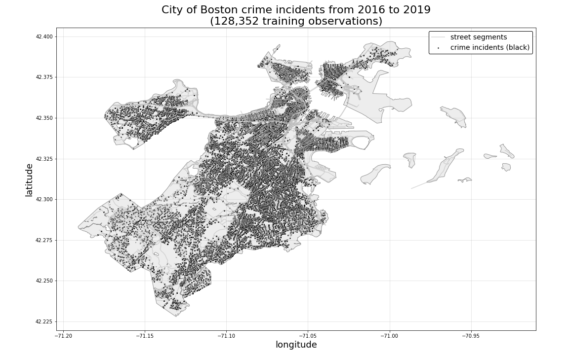
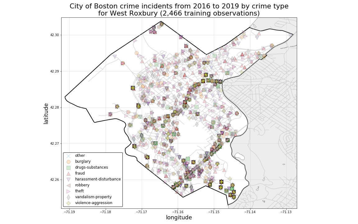
The plot below illustrates the distribution of crime records by each record’s associated geo-location coordinates in the City of Boston. By color-coding each plotted location point according to its associated crime-type class, we can see that crime types demostrate heavy spatial mixing, with each of the different crime-type classes having occured in close proximity or overlapping one another over time from the year 2016 through 2019.
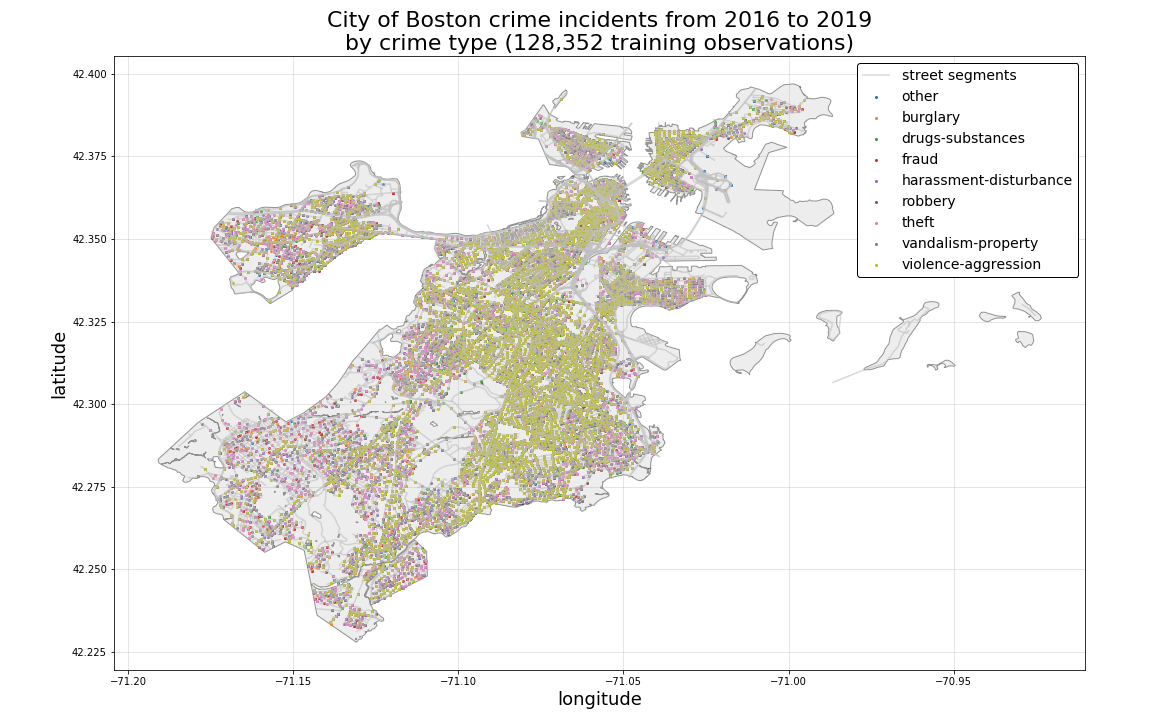
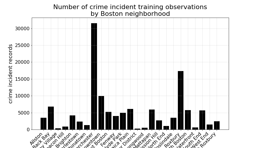
If we further subset our training records by Boston neighborhood, we can begin to examine bit more closely, whether this spatial mixing of classes might hold for all areas of the city, as well as how they might vary by particular neighborhood.
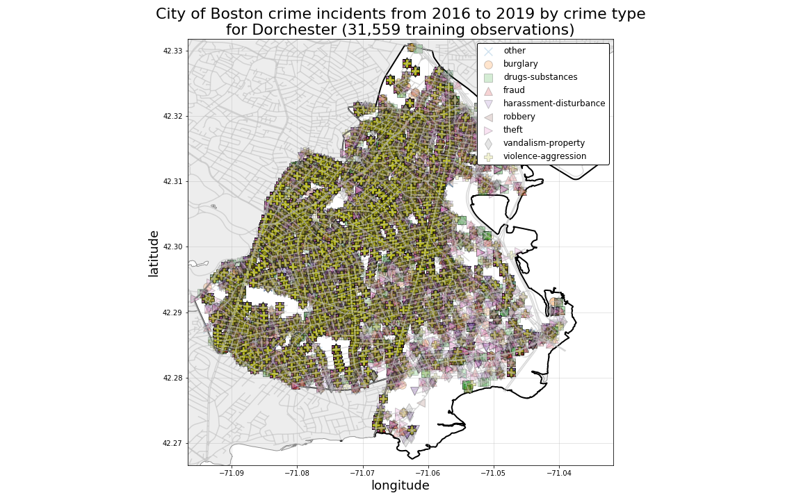
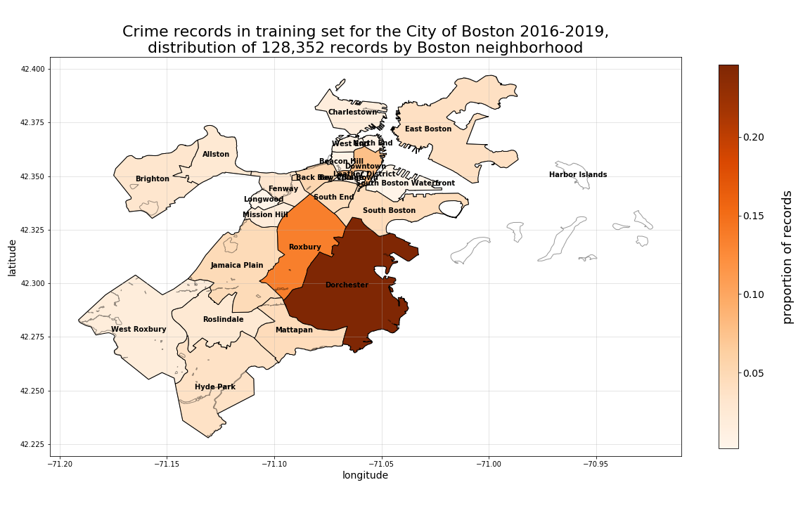
First, we can see that the greatest proportion of all total records occured in the Dorchester neighborhood, followed next by Roxbury, and then others.
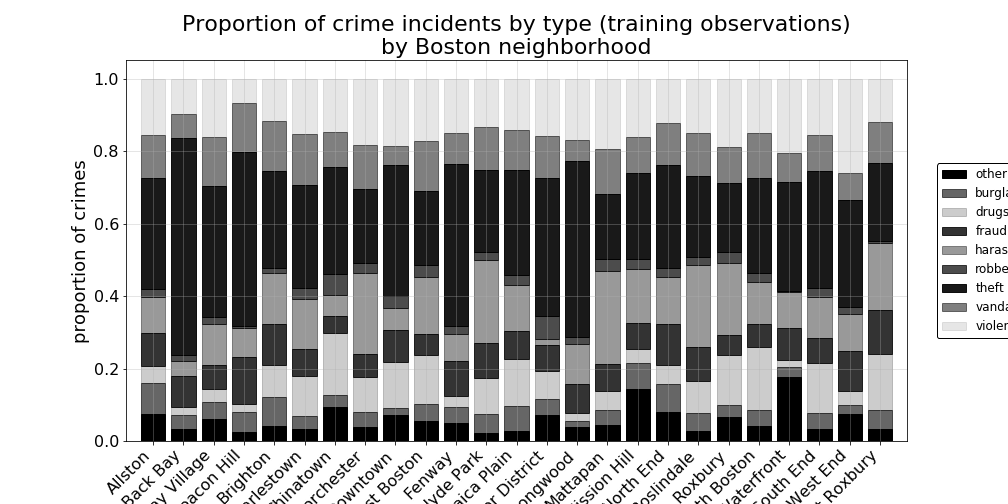
Examining this neighborhood-by-neighborhood breakdown a little more closely, we can see which particular neighborhoods experienced larger proportions of one crime-type versus another crime-type proportional each individual neighborhood’s own crime incidents.
For example, in the plot below we can see that Back Bay experienced the highest proportion of theft among their own crime incidents when compared to other neighborhoods. The West End leads with the highest proportion of violence-aggression type crimes, whereas Beacon Hill has the lowest incidence of those crimes. And, Mattapan appears to lead with the highest in-neighborhood proportion of harrassment-disturbance incidents, while there are relatively very few in the Leather District.
By looking at spatially mapped crime incidents in individual neighborhoods, we can also see a bit more clearly the overlapping nature of crime records by class. Starting with Dorchester, which we know to have the highest overall number of records, we can see just how densely mixed the crime incidents are.
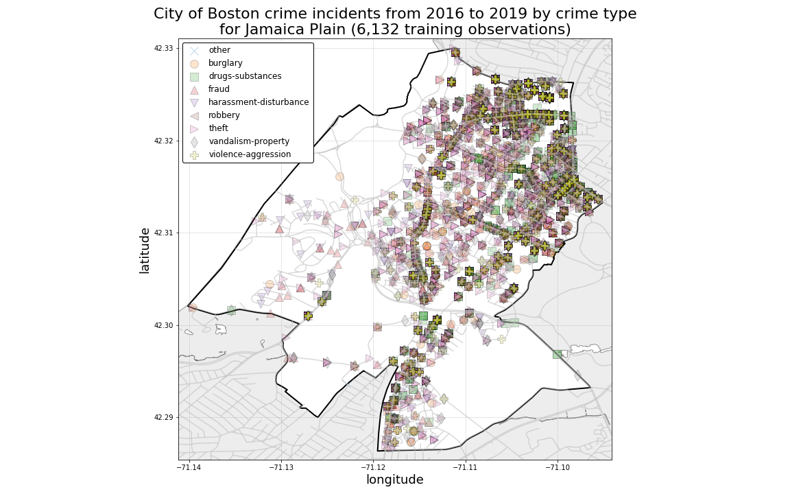
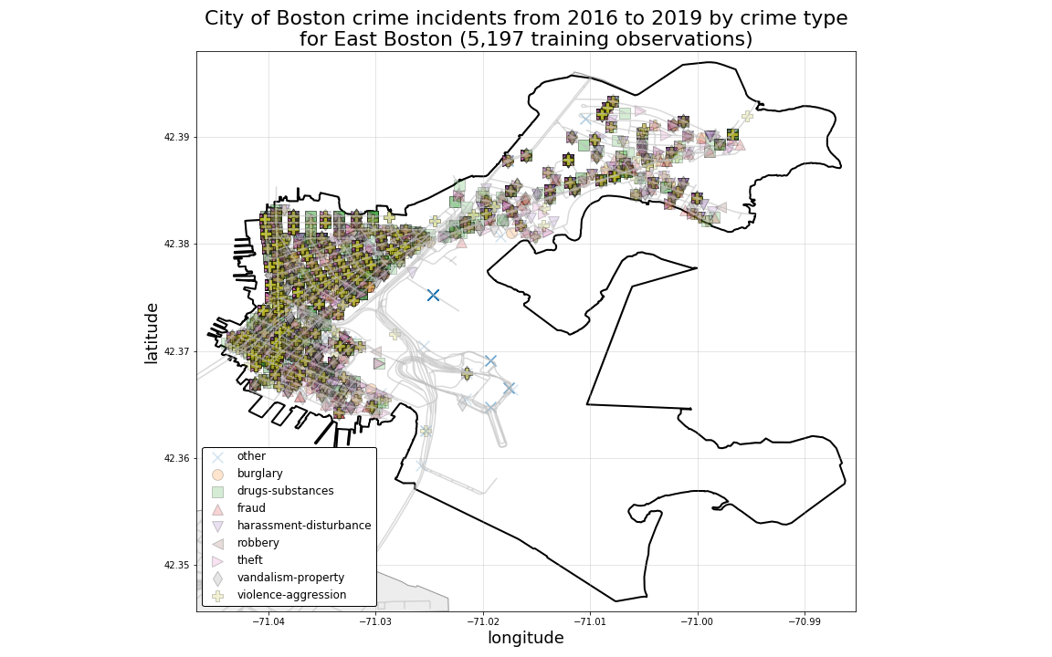
And, looking at Jamaica Plain and East Boston, as they are plotted below, we can see visually how crimes are more heavily clustered in the more heavily populated areas of each neighborhood.
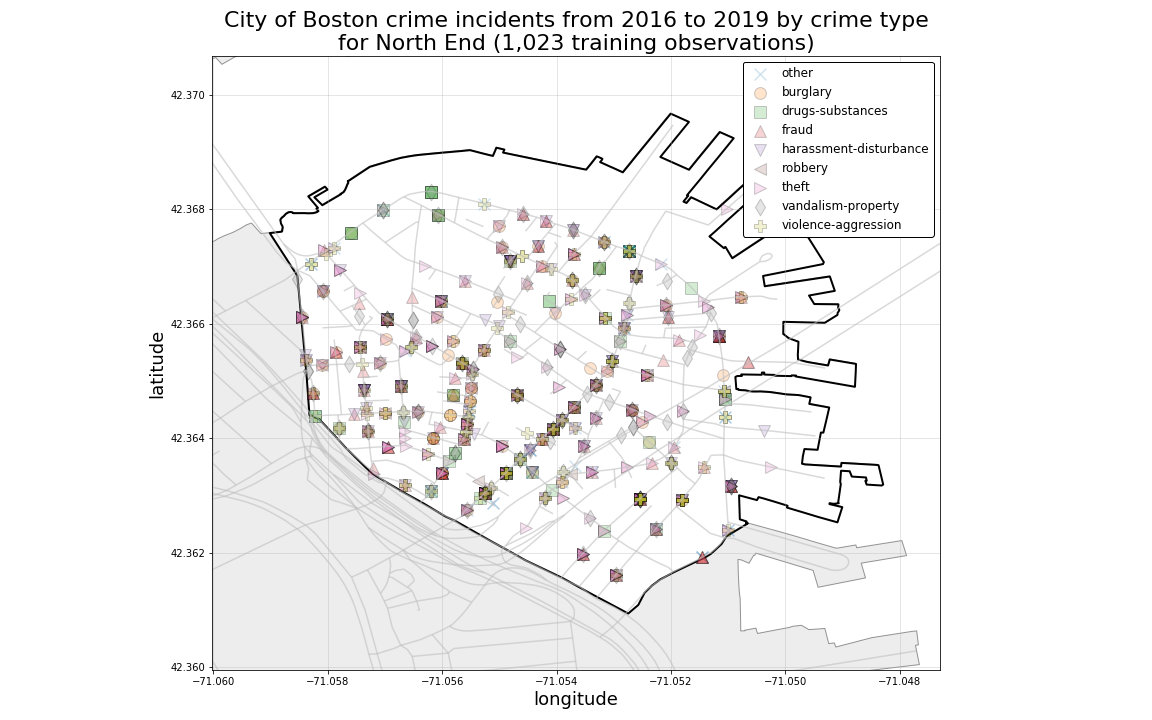
Even in Neighborhoods with a more sparse spatial distribution of crime records, we can still see evidence of heavy spatial mixing among crime-type classes.
PRELIMINARY CONCLUSION:
These observations suggest to us that purely locational predictors such as Latitude and Longitude alone will be insufficient for generating accurate predictions for each crime-type class.
Geographical change in crime records over time
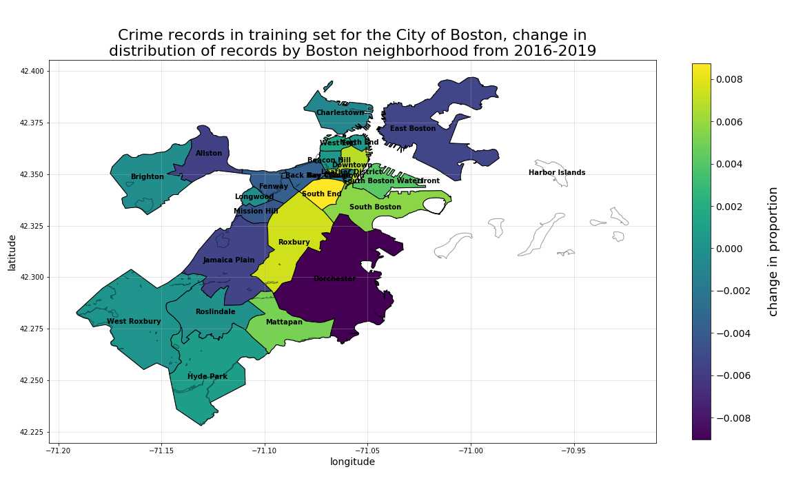
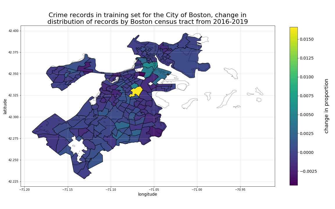
As was discovered during the initial EDA on the raw crime incidents records analysis, to meaningfully plot choropleth distributions of crime records, we must do so with a sufficiently granular set of geographic areas. As is shown below, at the neighborhood level, the disproportionately high volume of crime records in Dorchester overwhelm the plotted distribution. However, this same level of aggregation presents a very different look when we consider the 4-year annual neighborhood-by-neighborhood change in proportion of crime records from 2016 to 2019 as is shown in the second plot below. There we can see that Dorchester is actually decreasing in overall proportion, while the South End, Roxbury, Downtown, South Boston, and Mattapan are all increasing.
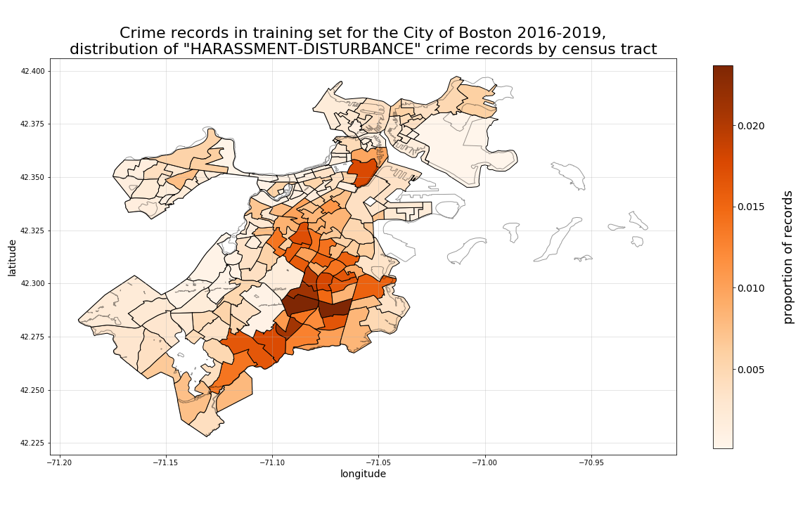
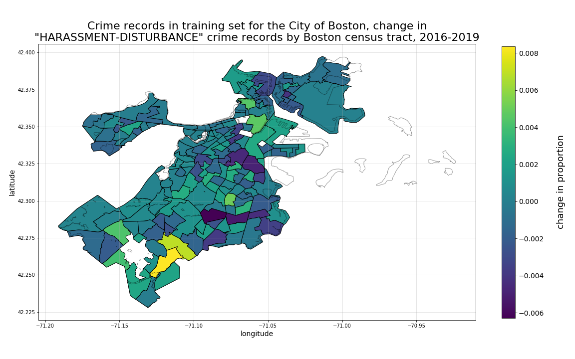
Then, by plotting with a more granular shape area such as census tract, we can see much more specifically, with a set of smaller sub-regions, where the highest concentration of crime incidents have occured, as well as very specifically, where they are increasing the most.
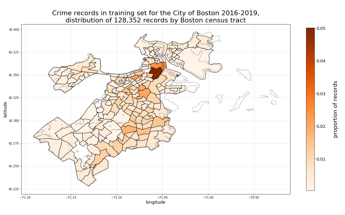
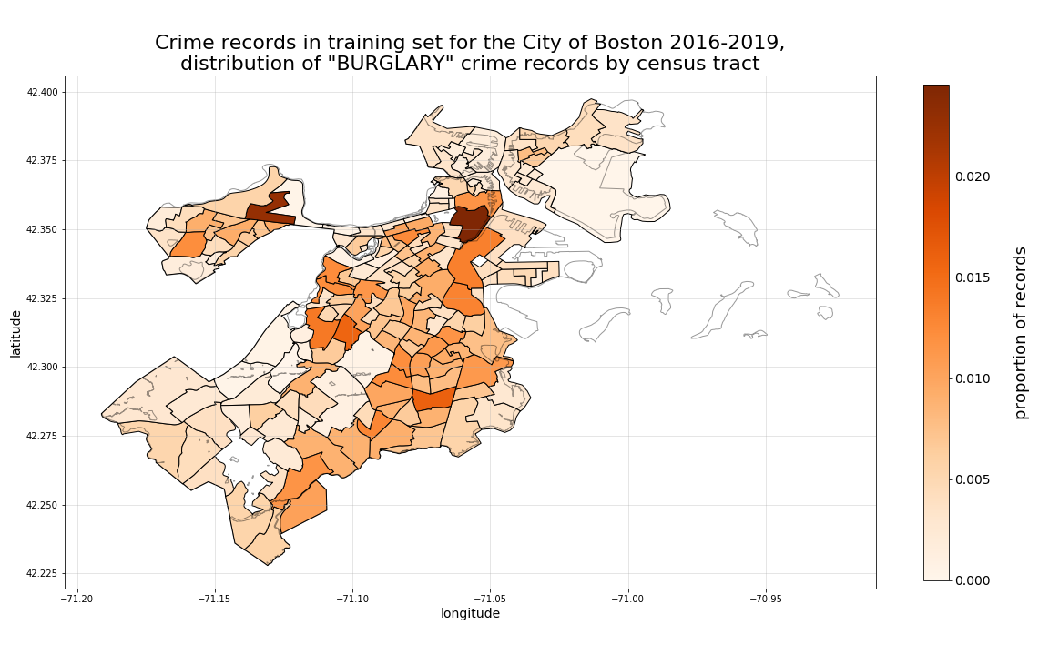
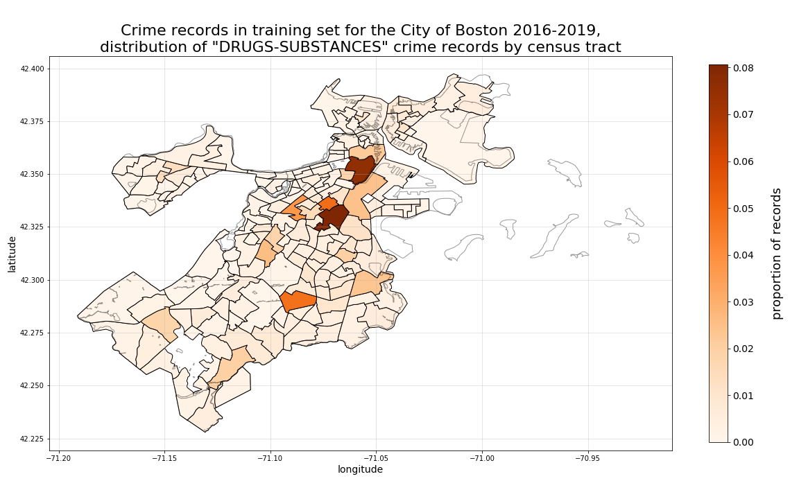
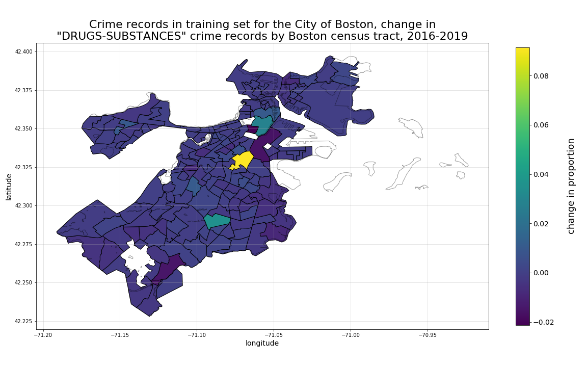
Therefore, for the next set of plots we will use census tract areas for plotting aggregated summary statistics examining 4-year change in locational crime record proportions by crime-type class (for just a subset of our classes to preserve space), we will use census tracts as our level of aggregation.
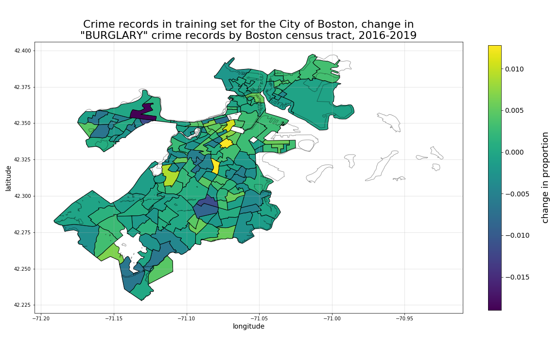
Our first example shown below are burglary crime records. Here we can see that, while there are particular “hotspots” for burglaries represented in our dataset Downtown and in Allston, when we view the same records in respect to their 4-year change in propoprtions, a different set of locational relationships emerge, with the same Allston tract proportion dropping relatively heavily over time.
Next, looking at drugs-substances crime records, we can see a different distribution of hotspots overall, with particulaly high 4-year growth in the tract straddling the South Boston, South End, and Roxbury borders.
Then, when we look at harassment-disturbance records, another distribution emerges, more heavily distributed in tracts corresponding to Dorchester, Roxbury, Mattapan, and Hyde Park. In this case, the 4-year growth is most heavily focused in the Hyde Park tract bordering Mattapan, with Dorchester dropping most rapidly.
To view similar plots for all crime-type classes, please review the original notebook in which these plots were produced, which can be found online here.
PRELIMINARY CONCLUSIONS:
These locational change by crime-type findings would suggest to us that, by including time-based predictors in our models such as year-based property-related metrics such as those described in detail on our property assessment data EDA page, should increase the overall predictive accuracy of our models.
Pair-wise relationship strength between predictors and crime-type classes
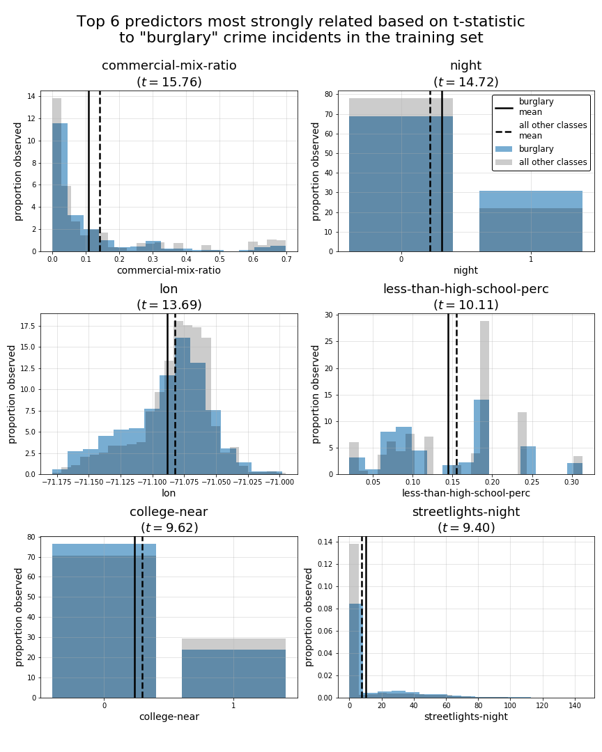
Looking beyond just location based and time-based predictors related to location, we will now examine the pair-wise relationships between our individual predictors versus each of our crime-type classes. To accomplish this, we will measure the strength of these relationships by calculating t-statistics for each of these pairings. Effectively, this will look in isolation at each predictor and class combination to determine the strength of that particular predictor’s strength in predicting the that class outcome in a “one-vs-rest” fashion.
Outlined below are the top 6 predictors, as measured using t-statistic for each crime-type class:
The predictors with the largest t-statistics related
to each crime-type class are:

class 0: other
                         tstat
owner-occupied-ratio     22.27
lat                      18.27
poverty-rate             17.13
median-age               17.01
enrolled-college-perc    16.39
streetlights-night        9.76


class 1: burglary
                                tstat
commercial-mix-ratio            15.76
night                           14.72
lon                             13.69
less-than-high-school-perc      10.11
college-near                     9.62
streetlights-night               9.40


class 2: drugs-substances
                              tstat
night                         34.35
streetlights-night            27.68
industrial-mix-ratio          26.97
Sunday                        25.63
less-than-high-school-perc    23.50
enrolled-college-perc         20.39


class 3: fraud
                                     tstat
less-than-high-school-perc           16.96
Sunday                               16.77
bachelor-degree-or-more-perc         14.74
residential-median-value-3yr-cagr    14.62
median-income                        11.65
enrolled-college-perc                11.11


class 4: harassment-disturbance
                                tstat
residential-gini-coef           64.20
bachelor-degree-or-more-perc    64.11
enrolled-college-perc           63.76
commercial-mix-ratio            63.10
residential-median-value        57.11
college-near                    57.01


class 5: robbery
                                     tstat
less-than-high-school-perc           11.04
streetlights-night                   10.14
lon                                   8.77
night                                 8.13
bachelor-degree-or-more-perc          7.53
residential-median-value-3yr-cagr     7.50


class 6: theft
                                tstat
bachelor-degree-or-more-perc    68.57
residential-gini-coef           61.65
enrolled-college-perc           60.34
residential-median-value        59.61
less-than-high-school-perc      54.19
college-near                    50.52


class 7: vandalism-property
                                tstat
commercial-mix-ratio            26.47
college-near                    22.72
residential-median-value        21.42
residential-gini-coef           20.61
enrolled-college-perc           19.23
owner-occupied-ratio            12.65


class 8: violence-aggression
                                tstat
less-than-high-school-perc      20.03
bachelor-degree-or-more-perc    17.88
median-income                   15.81
streetlights-night              15.32
residential-gini-coef           15.11
poverty-rate                    14.03
Now, for the sake of consistency with the previous section of this EDA, we will use plots to examine these top 5 predictors for the sames subset of predictors burglary, drugs-substances, and harassment-disturbance.
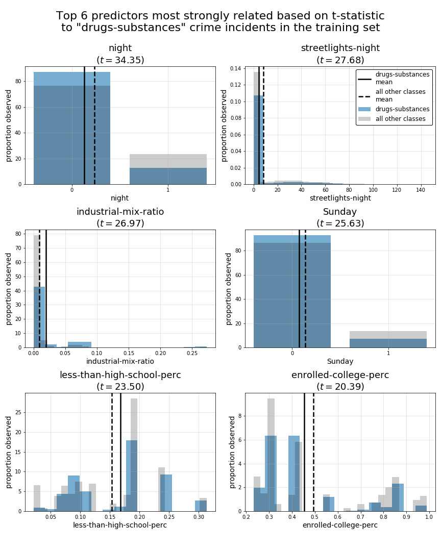
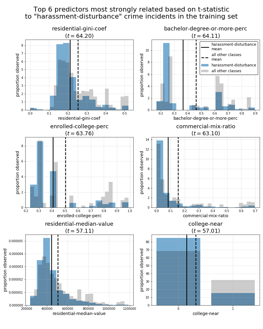
PRELIMINARY CONCLUSIONS:
In above summary tables and plots, we can see a fairly broad mixture of top 5 predictors across all of our crime-type classes. This leads us to believe that we may have a suitable variety of predictors for the classes we hope to predict. However, while some crime-type classes such as theft and harassment-disturbance have top predictors with t-statistics exceeding 60, some classes such as violence-aggression, robbery, and burglary have much smaller top t-statistic values less than 25. This suggests those classes may be prove to be harder to predict accurately using this set of predictors. However, what’s not accounted for in these t-statistic measures is the potential interaction effect of trying to generate predictions for each specific crime-type class with multiple predictors at once.
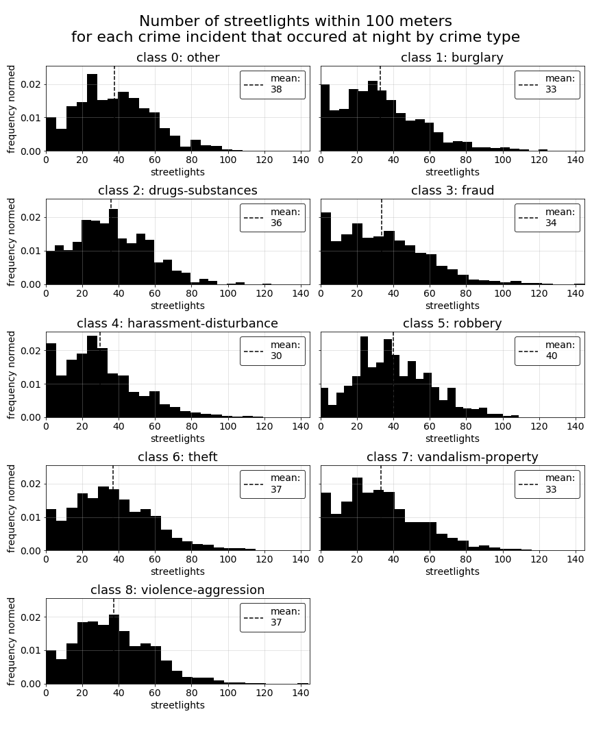
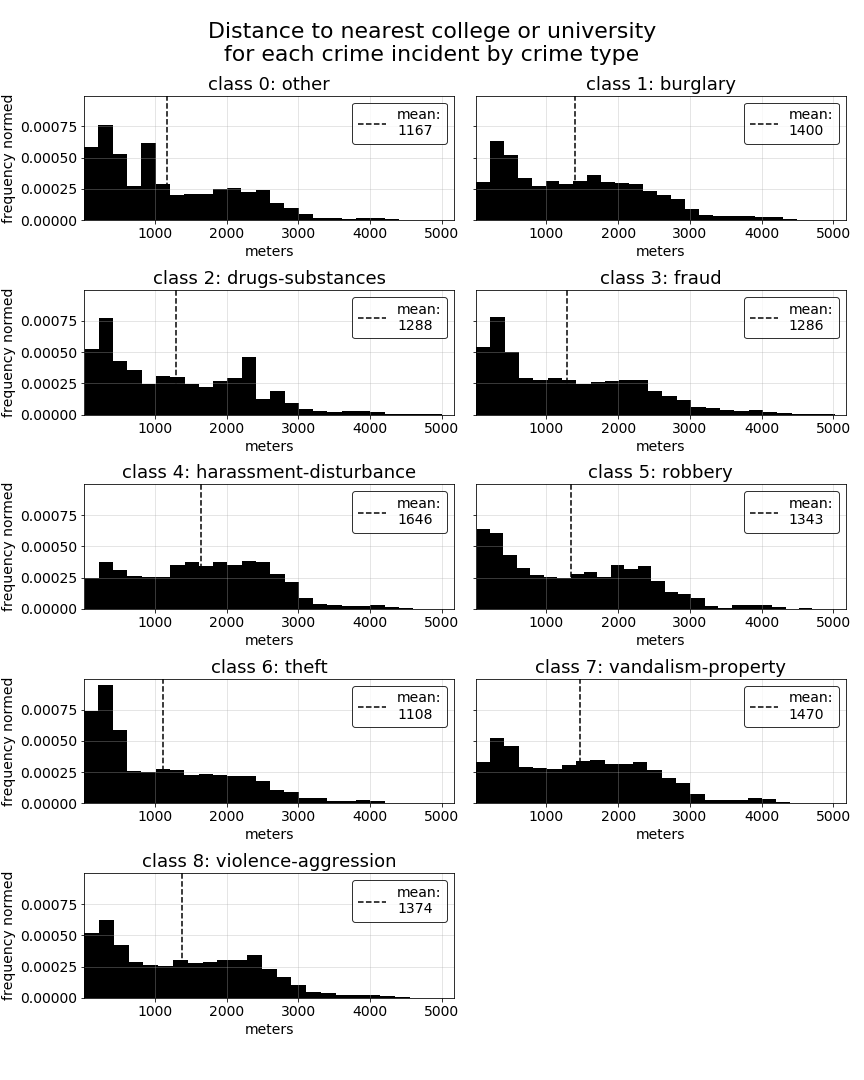
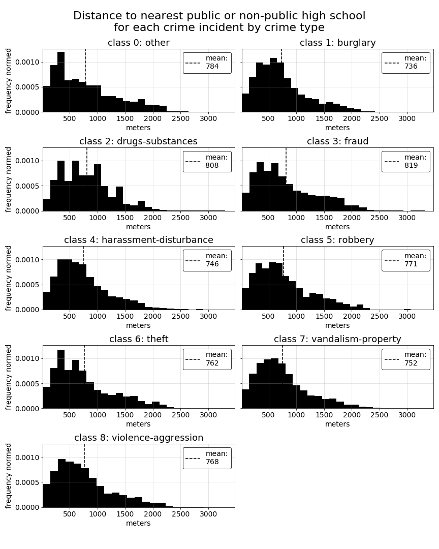
Evaluating distance-based geographical predictors by class
In the previous section of this EDA, we saw a couple of our distance-based predictors in the top 5 predictors for several of the crime-type classes. This leads us to wonder how these predictors might vary overall among all of our class types. The specific predictors we would consider distance-based are streetlights-night, which measures the number of streetlights within 100 meters of each crime record for crimes occuring at night, college-near, which indicates whether or not a crime incident occured wihtin 500 meters of a college or university, and highschool-near, which indicates whether a crime incident occured within 500 meters of a public or non-public highschool.
All measurements used in these predictors were calculated using the Haversine formula to measure the distance between sets of latitude and longitude coordinates. A detailed description of the Haversine implementation built for our analysis can be found on this site page.
Note that, for the purpose of better understanding the underlying nuances of distance to the nearest college or university and highschool, we will plot the actual distances per crime record rather than the proximity indicator for each.
For each of the below predictors, we do see some variations in distributions among the different crime-type classes. Most notable are the difference in distances to the nearest college or university for some of the classes. The difference between college distance distributions for harrassment-disturbance versus theft records provides a good example of how these relationships can vary, and likely contribute to college-near showing up several times in our top 5 t-statistics tables above.
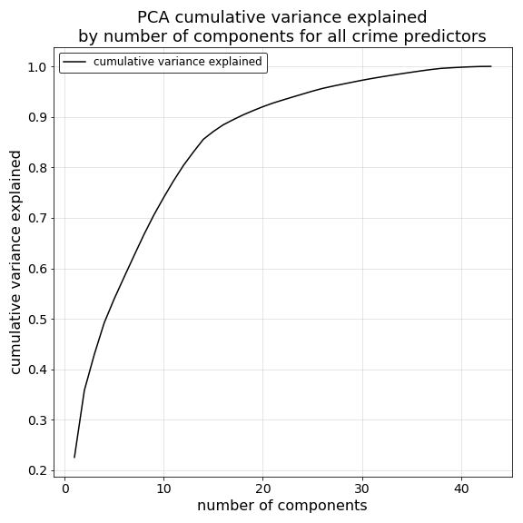
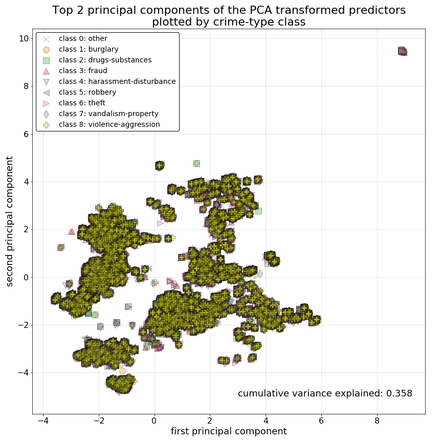
Dimensionality reduction with principal component analysis (PCA)
To gain a better sense for how well we might be able to separate classes given the predictors we currently have on hand, we now use the unsupervised learning method PCA to reduce the number of dimensions in our predictor set. Doing so will help us to understand explained variance in our predictors regardless of our target response classes, and will help us to visualize our crime-type classes along the two PCA reduced dimensions with the greatest levels of explained variance. Thus, giving us a sense for how easily separable our crime-type classes might be given these predictors.
First we can examine the growth curve in cumulative explained variance plotted against the number of principal components derived from our standardized predictor data. Here we can see a distinct elbow in explained cumulative explained variance growth when we reach 14 components and approximately 85% explained variance, indicating diminishing returns for all components beyond that point.
Next, we isolate our top 2 principal components and plot them against one another. In this plot we have labeled the crime-type class of each observation. Immediately we can see that PCA does very little to separate our response classes using these top 2 components. The observations do however appear to have achieved some sort of separation across some other dimension not measured here. Regardless, this indicates to us that our prediction models will also likely have difficulty separating out the crime-type classes we have outlined here given our predictor variables.
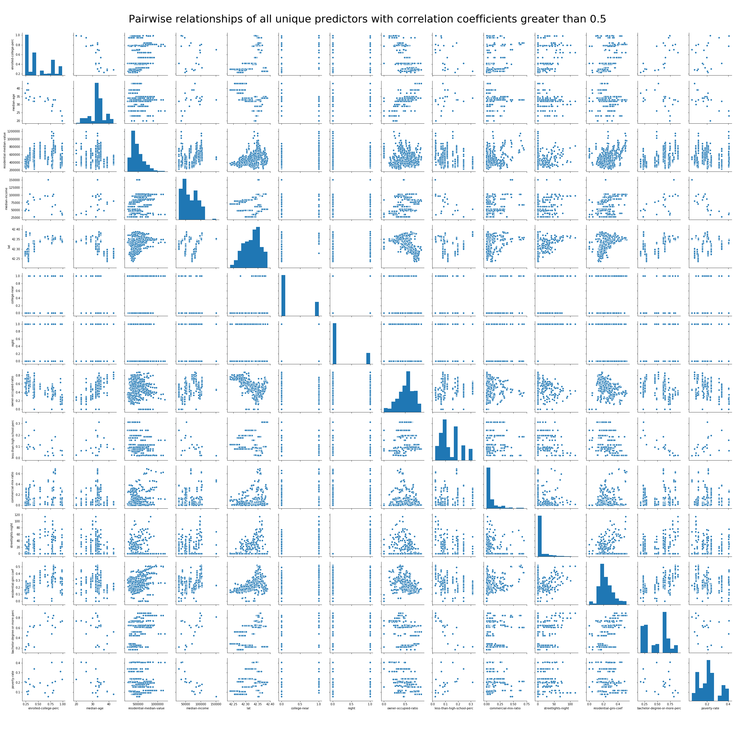
Correlation of predictors and multi-collinearity risk
As a final step in our model data EDA, we will investigate correlation and multi-collinearity of the predictors we have engineered for our model.
To acheive this, we first generate a pair-wise correlation matrix for each unique pair of predictors, sorted in descending order as is shown below for all resulting correlation values greater than 0.50. Here we can see 27 paired predictors with moderate to high correlation (with 14 unique predictors contained in the list). Of these, would expect night and streetlights-night to be strongly correlation becuase streetlights-night is an interaction term partly derived from the values in night.
in fact, streetlights-night will only contain non-zero values for crime records that occured at night. Additionally, the other several top correlated pairings also make sense. We should expect both poverty-rate and median-income measured at the neighborhood level to have a strong negative relationship. Likewise, we should expect the same negative relationship between bachelor-degree-or-more-perc and less-than-high-school-perc.
The most strongly correlated predictors (corr > 0.50) in our predictor
set and their corresponding correlation values are:
                                                                corr coef
poverty-rate                       median-income                    0.832
bachelor-degree-or-more-perc       less-than-high-school-perc       0.830
night                              streetlights-night               0.814
enrolled-college-perc              bachelor-degree-or-more-perc     0.776
owner-occupied-ratio               enrolled-college-perc            0.736
median-age                         owner-occupied-ratio             0.727
residential-gini-coef              residential-median-value         0.719
median-income                      less-than-high-school-perc       0.718
bachelor-degree-or-more-perc       median-income                    0.714
bachelor-degree-or-more-perc       residential-gini-coef            0.672
college-near                       enrolled-college-perc            0.670
poverty-rate                       median-age                       0.669
enrolled-college-perc              residential-gini-coef            0.663
bachelor-degree-or-more-perc       residential-median-value         0.629
median-age                         enrolled-college-perc            0.624
lat                                enrolled-college-perc            0.621
college-near                       residential-gini-coef            0.612
owner-occupied-ratio               lat                              0.610
residential-median-value           commercial-mix-ratio             0.610
residential-gini-coef              commercial-mix-ratio             0.605
college-near                       bachelor-degree-or-more-perc     0.583
lat                                bachelor-degree-or-more-perc     0.562
residential-median-value           college-near                     0.556
lat                                residential-gini-coef            0.555
residential-median-value           enrolled-college-perc            0.554
enrolled-college-perc              commercial-mix-ratio             0.550
median-income                      residential-median-value         0.523
To further examine these relationships we can begin by plotting scatter-matrices of the 14 unique predictors contained in the correlation table above.
PRELIMINARY FINDINGS:
Given the strength of correlations among a handful of our predictors, with additional time and future iterations of our analysis, this is high on our list of priorities to address. To address this, for the most strongly correlated predictor pairings we will consider methods such as centering to alleviate potential correlation issues and the removal of at least one of the predictors from the pairings to see what effect each change has on our models and the interpretability of our results.